

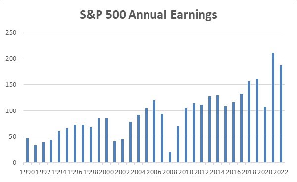
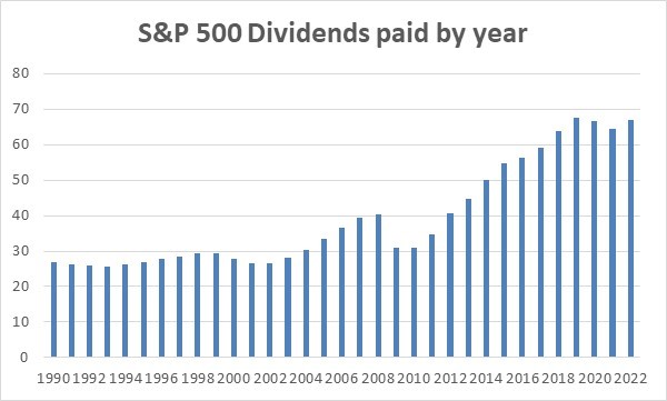
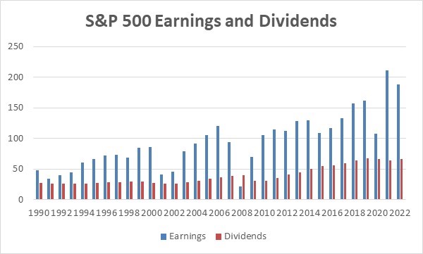
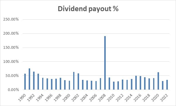
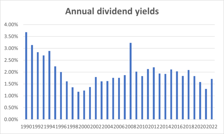
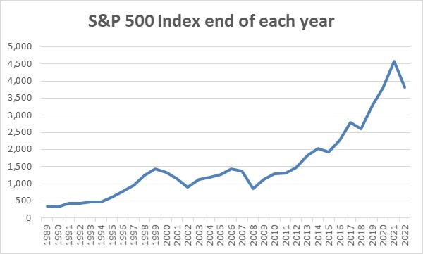
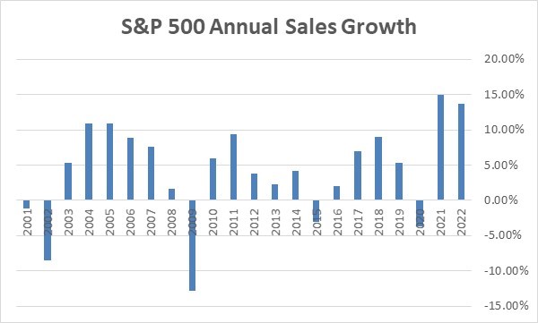
I find the following information interesting and informative and put them in charts for easy viewing. The charts start with 1990 and go through the end of 2022.
The chart with the annual sales growth starts in 2001. I prepared the charts, but the underlying data came from Multpl, which has a ton of additional information and statistics, and I recommend checking it out. In the next few weeks, I will post some more charts and then my analysis of what has happened with the markets.
The title of each chart is self-explanatory, so I won’t add anything more at this point. I will discuss each chart in my analysis in a few weeks. When my updates are completed, I will incorporate this information into my 100-page stock market booklet and make it available to readers for free. I will let you know when you can request it.
Contact Us
If you have any tax, business, financial or leadership or management issues you want to discuss please do not hesitate to contact me at [email protected] or click here.