Lockstep Applications are the interfaces to Lockstep API. These interfaces have a diverse user-base and are expected to provide the same experience on all device types. Given how modern devices deviate from the conventional aspect ratios and have wider screens, bigger panels, higher resolutions – providing the same experience and designing for responsiveness is non-trivial. This two-part series explains the challenges and solutions for responsiveness.
- Part 1 – Problem and Potential Solutions – Media Queries, Fluid Design and Adaptive Design
- Part 2 – The Most Effective Approach – Adaptive Design
Part 1 – Problem and Potential Solutions – Media Queries, Fluid Design and Adaptive Design
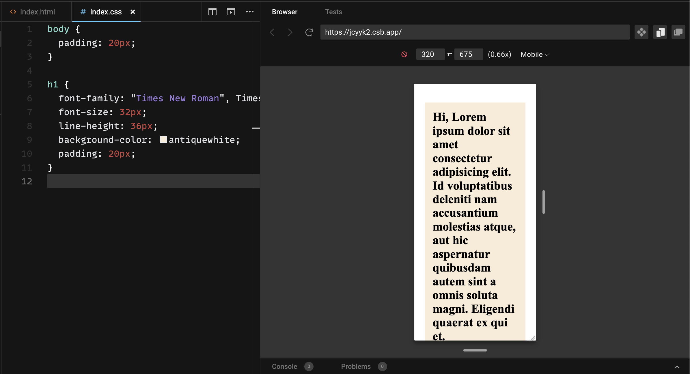
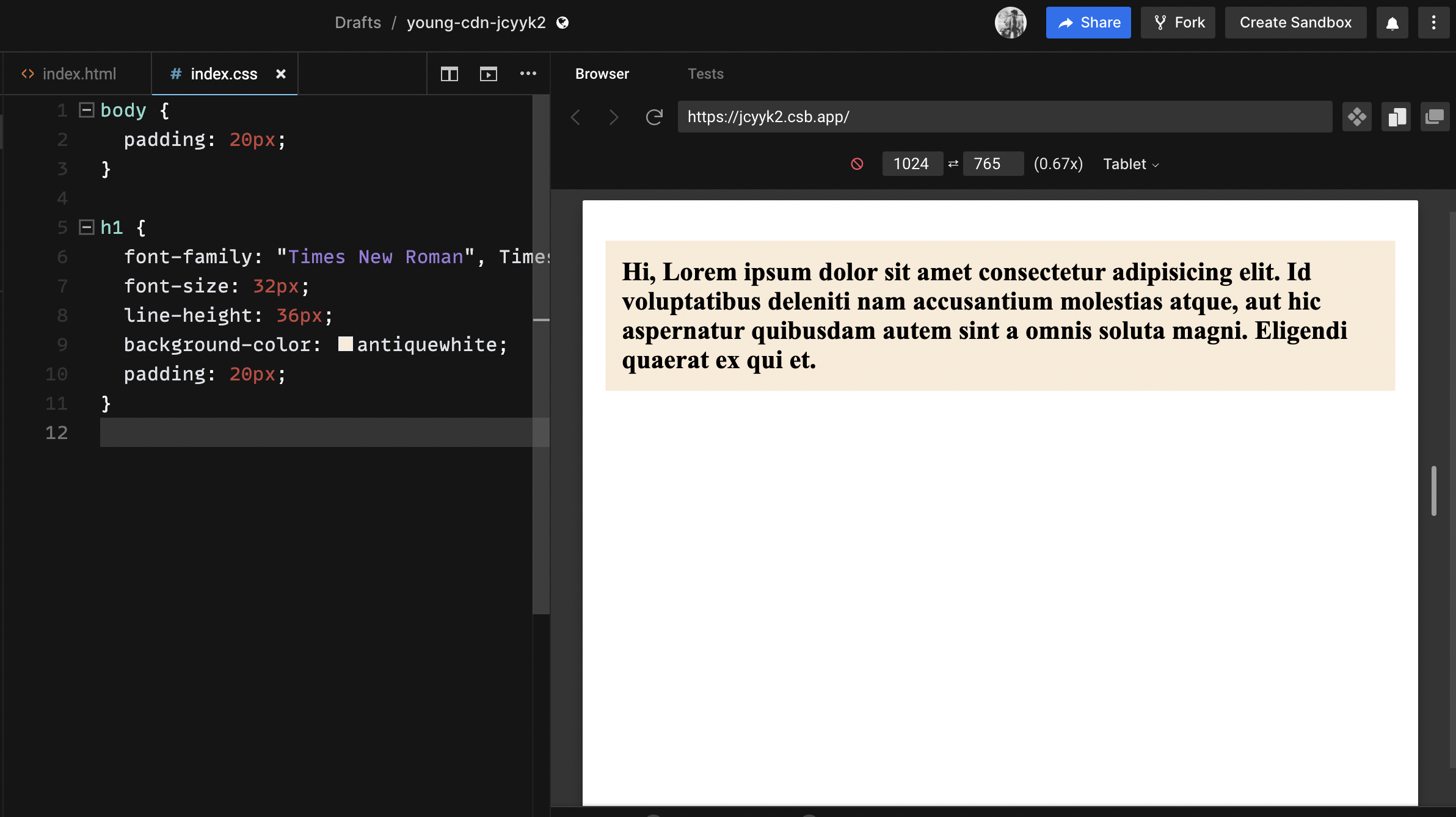
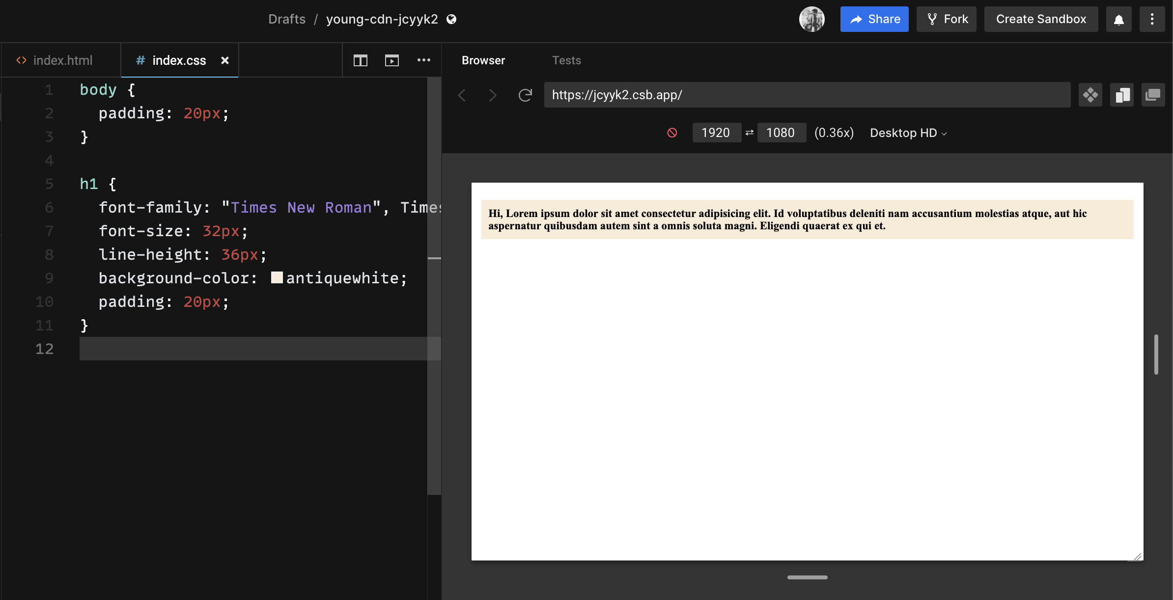
Let’s begin by understanding the challenges in creating responsive layouts. Here’s how the content looks on different screen dimensions for a website that has not handled responsiveness:

However, many companies are experiencing a spike in burnout, rather than a reduction. With unlimited PTO policies, many employees are hesitant to take any time off of work. They feel that they need to be available 24/seven and that any time spent away from work is time wasted.
Media Queries
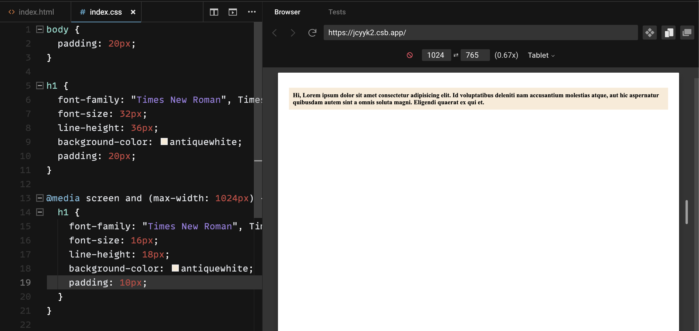
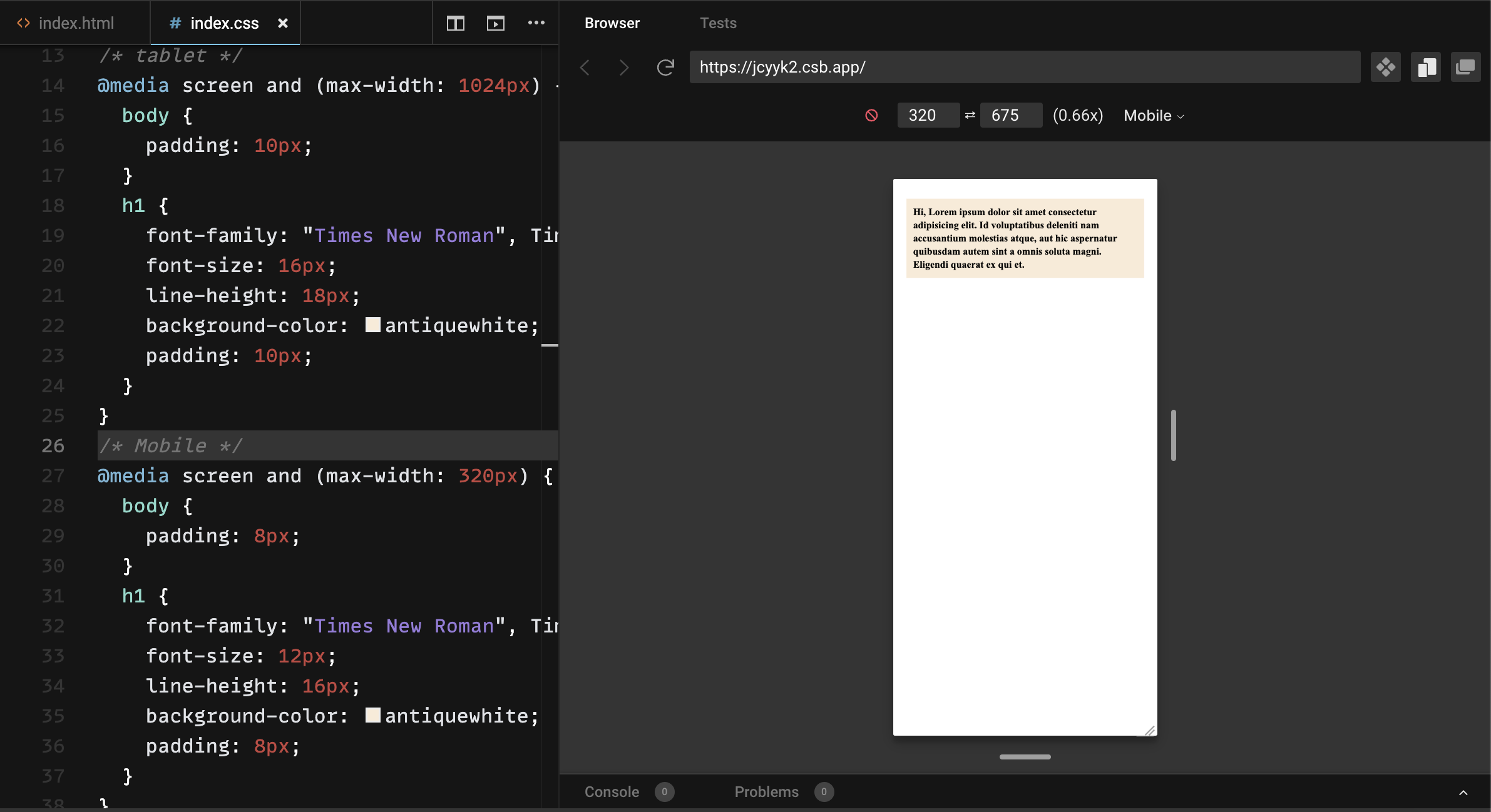
The traditional approach to solving for responsiveness is identifying the device types and writing media queries for each device type.
These designs were created keeping in mind standard 720p (1280px * 720px) or 1080p (1920px * 1080px) resolutions for personal computers and then standard alterations of that primary design were made to keep incorporating those styles for mobile and tablets as well. Because of this, developers would write different stylings for different target devices. This was done using media queries.
1080p (1920px * 1080px) – Desktop
(1024px * 765px) – Tablet
(320px * 675px) – Mobile
Pros :
- Easy to implement when the device types are already known.
Cons :
- As the application grows, stylesheet management becomes difficult.
- Modern device needs are difficult to predict, and hence, it’s difficult to predetermine what dimensions to build for.
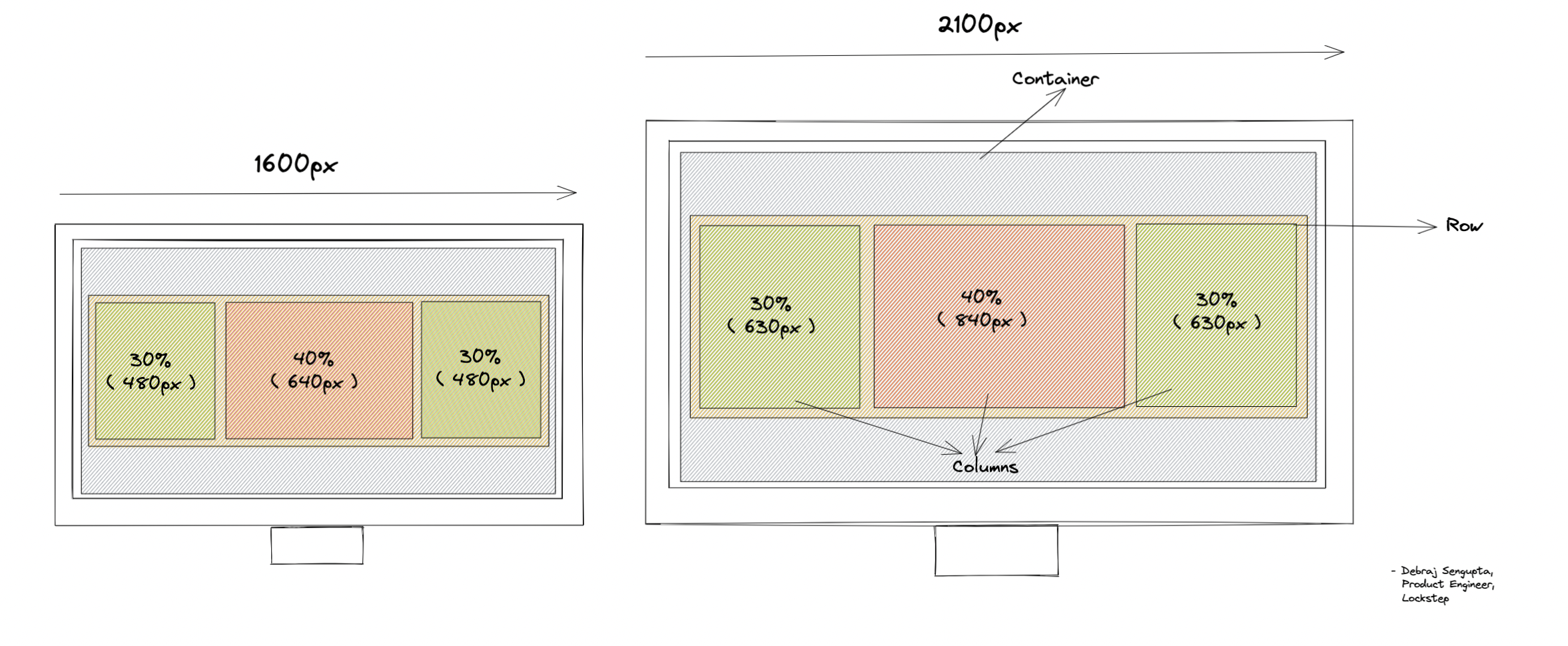
Fluid Design
In this system, every element is wrapped in freely flowing containers, which are designed using CSS Grids or Flexbox, and their elements are mostly styled using the relative styling unit (%). These containers are further divided into rows and columns. Depending upon the screen size, these columns can be automatically adjusted to show the content.
Pros:
- Relative styling within containers offers flexibility to cover most device types.
Cons:
- The elements are still bound within containers and therefore, not truly flexible.
- Different device types may need very different styling for e.g. www.youtube.com and m.youtube.com, which relative styling alone can’t address.
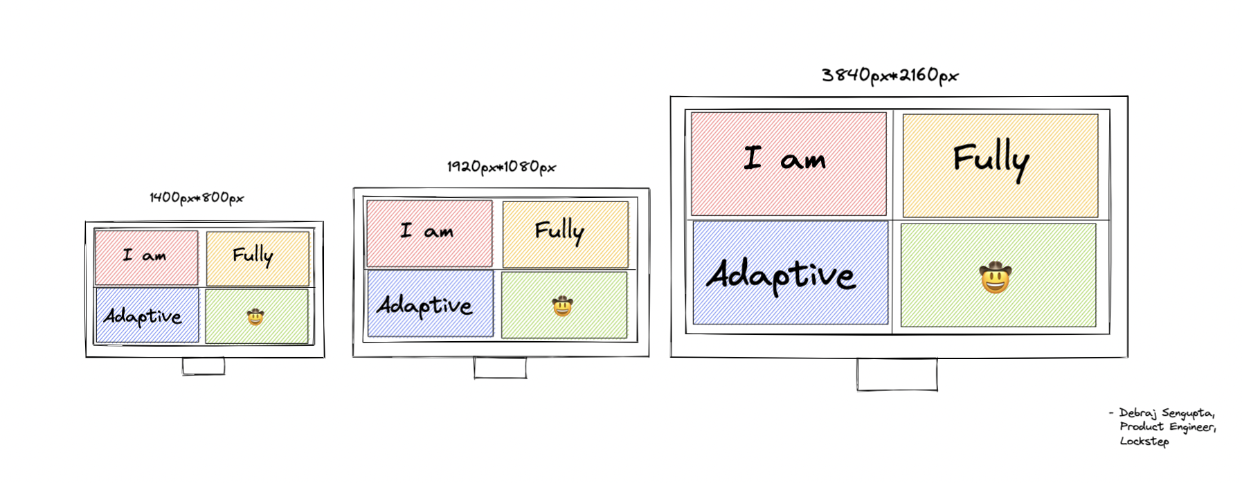
Adaptive Design
Adaptive Design enhances the liquid design of the HTML by making the elements reconstruct themselves as per the number of pixels available over the viewport. This design follows the One System Different Design method and uses various approaches to make the system truly responsive.
Pros:
- The designs can now be truly responsive, adjusting to all device types.
Cons:
- This system needs an in-depth understanding of pixels and screens; therefore, it is not the easiest to learn and adapt.
Considering the pros and cons, it is evident that adaptive design solves the problem of responsiveness proactively and is therefore, the best choice for a scalable application design. We will dive deep into adaptive design implementation in Part 2 of the series.
Blog by: Debraj Sengupta, Lockstep


